There’s always a need for a safe place at school.
A place where you feel confortable, where you can ask for help or answers.
This place needed to have her own identity.


BRIEF
The idea was to create an identity based on light colors to differentiate the different sectors of this area. I was asked to create something sweet but also clear. I had to create a logo, some posters but also the design of the doors.
CONCEPT
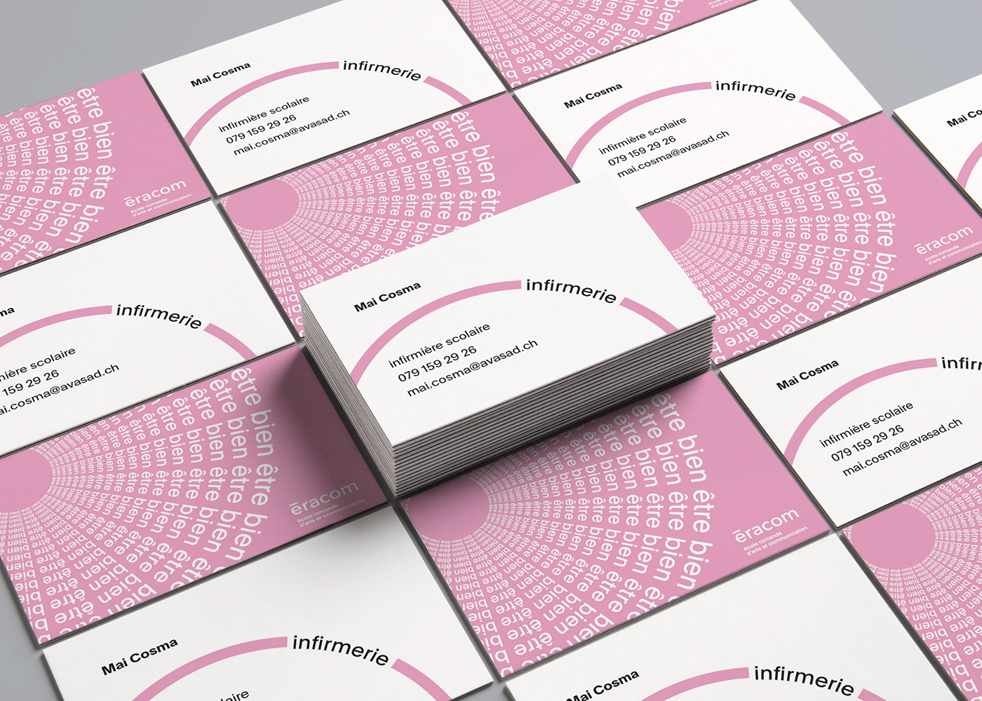
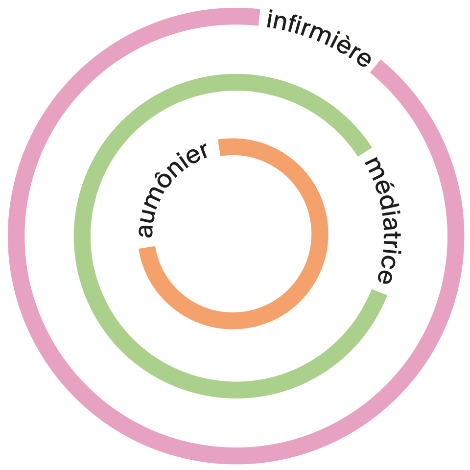
The concept is to understand that this place is a safe place and that every services which are provided here are linked. That’s why I decided to go for this circular design. The colors are very light to be appealing without being aggressive. They can also move depending on the support to show how flexible the people that work here are.
APPLICATION
The design was applied on 3 doors inside of the place and 3 posters in the corridor in front of the place. The concept was also applied to create a schedule system to understand exactly when each person of this area is available. A proposition was also done for the visit cards, but they weren't developed at the end.